Light-Fingered Lichtenstein
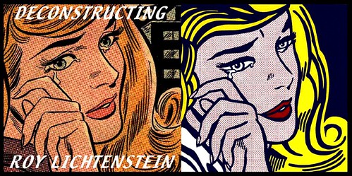
 Left: the original comic book panel; right: the Roy Lichtenstein piece. Many similar examples at DECONSTRUCTING ROY LICHTENSTEIN.
[Via Papel Continuo]
REG. U.S. PAT. OFF.
 Left: the original comic book panel; right: the Roy Lichtenstein piece. Many similar examples at DECONSTRUCTING ROY LICHTENSTEIN.
[Via Papel Continuo]


4 comments:
makes me feel bad for sort of liking Lichtenstein.
There wasn't really anyone of these where he improved the drawing at all.
No... but I like him, too.
While on the surface, I would tend to agree with the comment about Lichtenstein's work not doing much to improve the original art, improving the art was not really the point of the pop-art movement. The movement was the merging of low art (pop culture such as advertising or comic books) and traditional high art (paintings, sculpture, etc.). If Andy Warhol would have just painted a portrait of Marilyn Monroe, it would not have been pop art. Because he did so, changing colors and stylizing the features (similar to what Lichtenstein did in his benday-dot pieces), the work became part of a larger movement.
In a way, one could look at Lichtenstein as elevating the artwork in comics to be seen in the same forum as traditional high art.
I have always resented the dishonesty of Lichtenstein, in removing everything that was distintive and original in the artwork he worked from, to create crudely stereotyped images and offering them to the public, saying, "This is what comics are like!"
Post a Comment